Overview

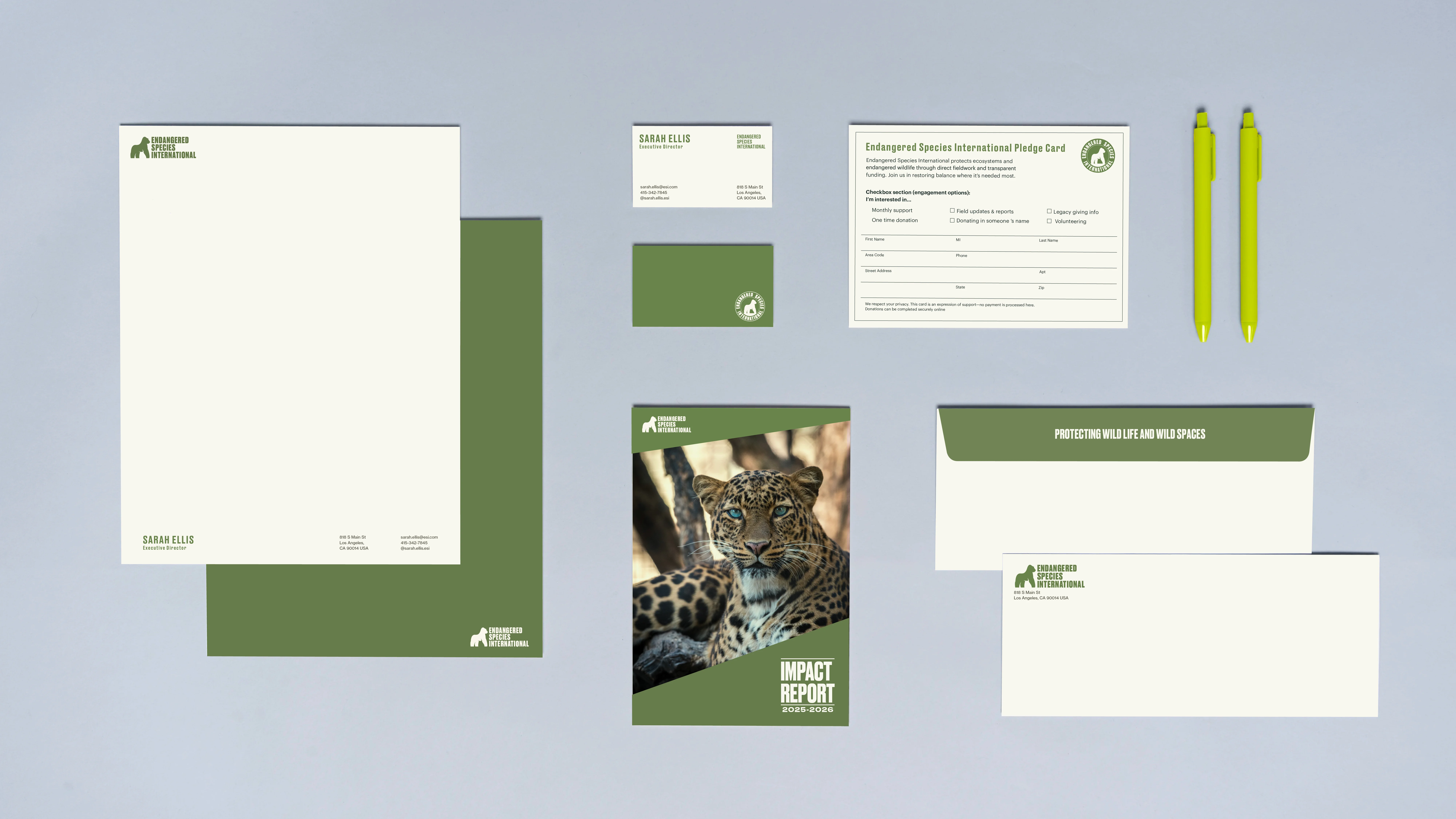
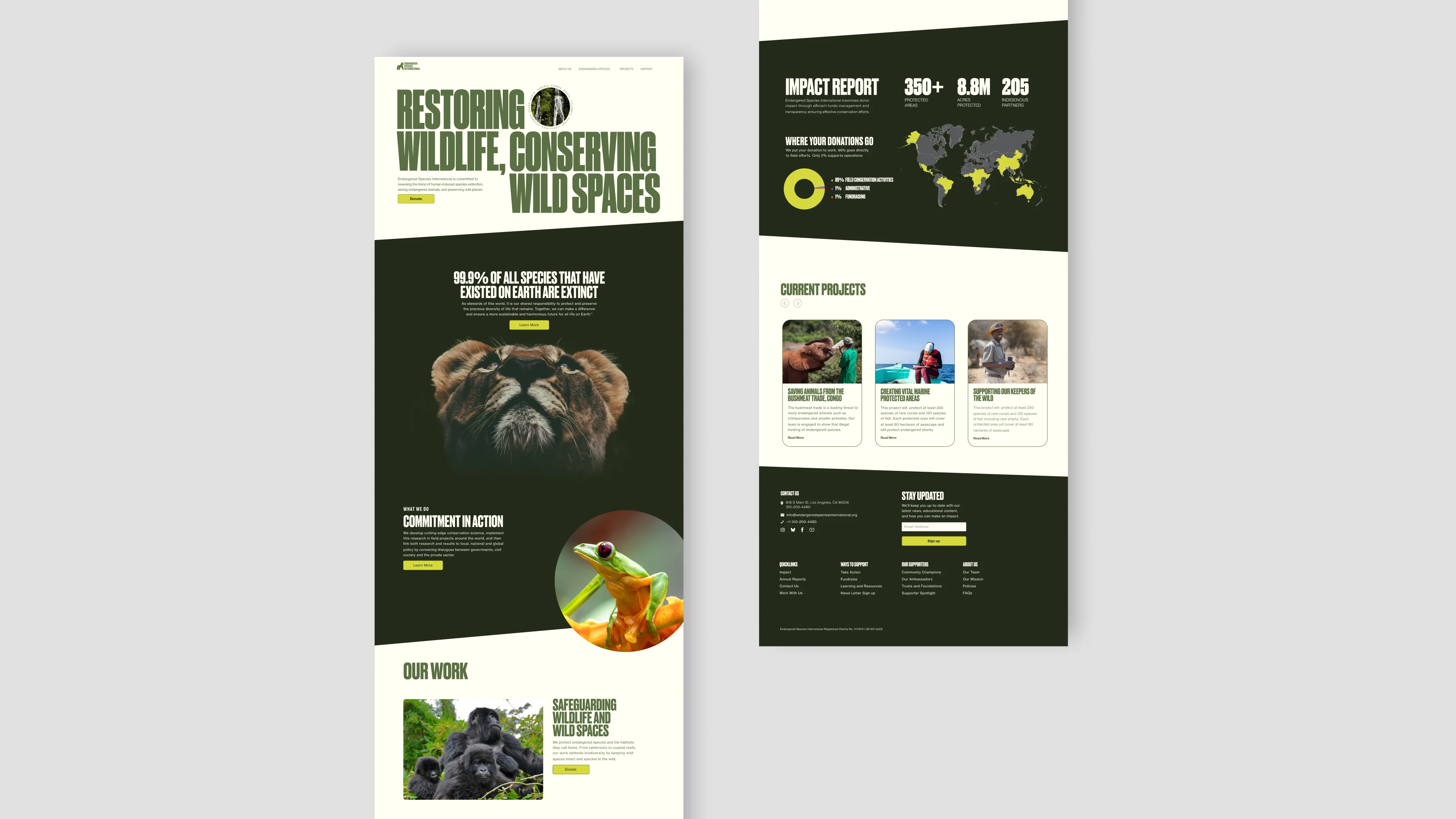
The rebranding of Endangered Species International (ESI) builds a confident, clear identity for a conservation nonprofit focused on real world impact. Prioritizing transparency, fieldwork and trust, the new system simplifies how the organization communicates its mission and values. Through a cohesive visual language and purpose driven collateral, the brand reflects ESI’s efficient use of resources and deep commitment to protecting endangered species where it matters most,  on the ground.

Services

Rebranding

Personality

Confedent
Trustworthy
Impact driven

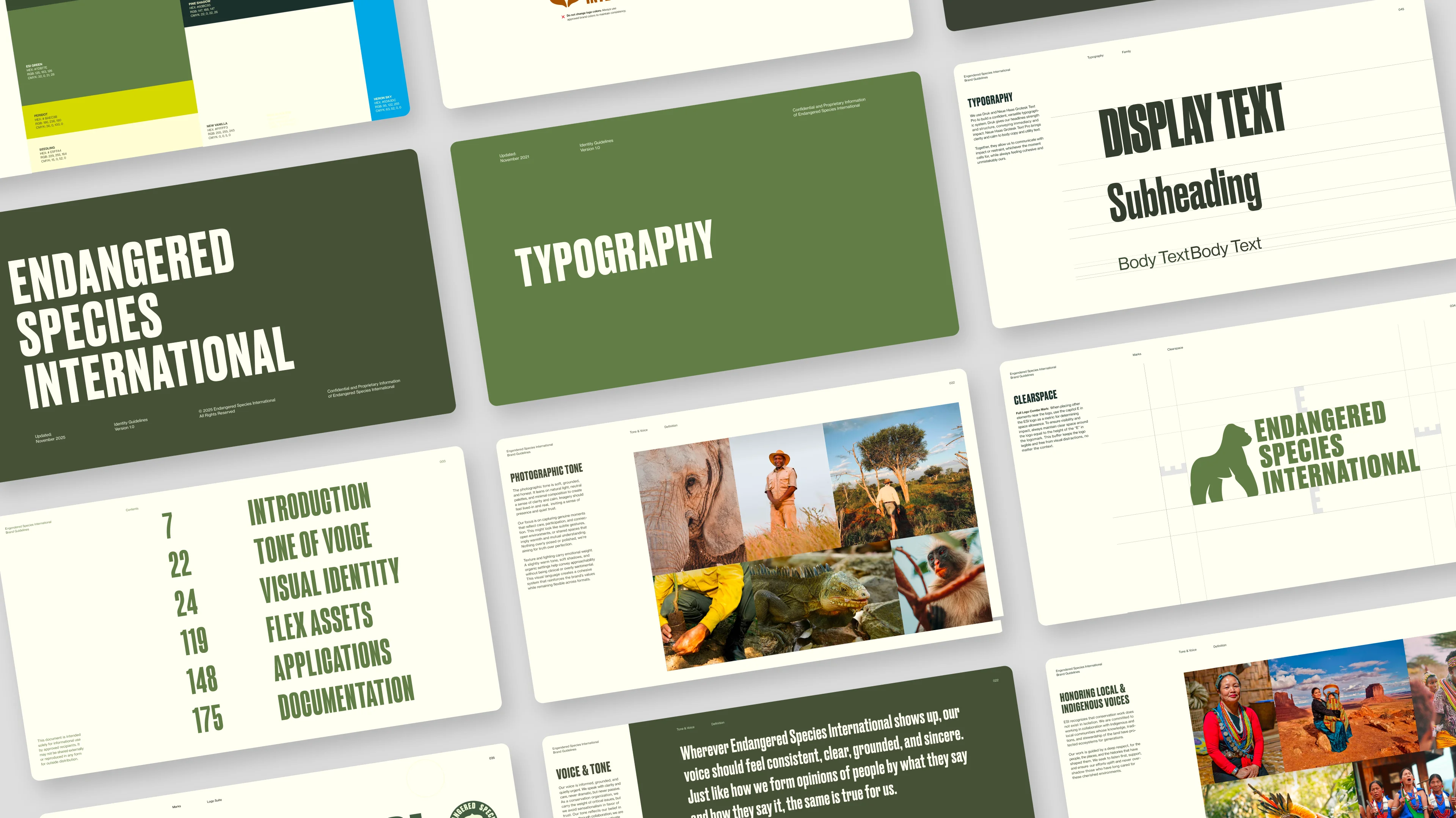
Typefaces

Druk
Neue Haas Grotesk

Completed

2025

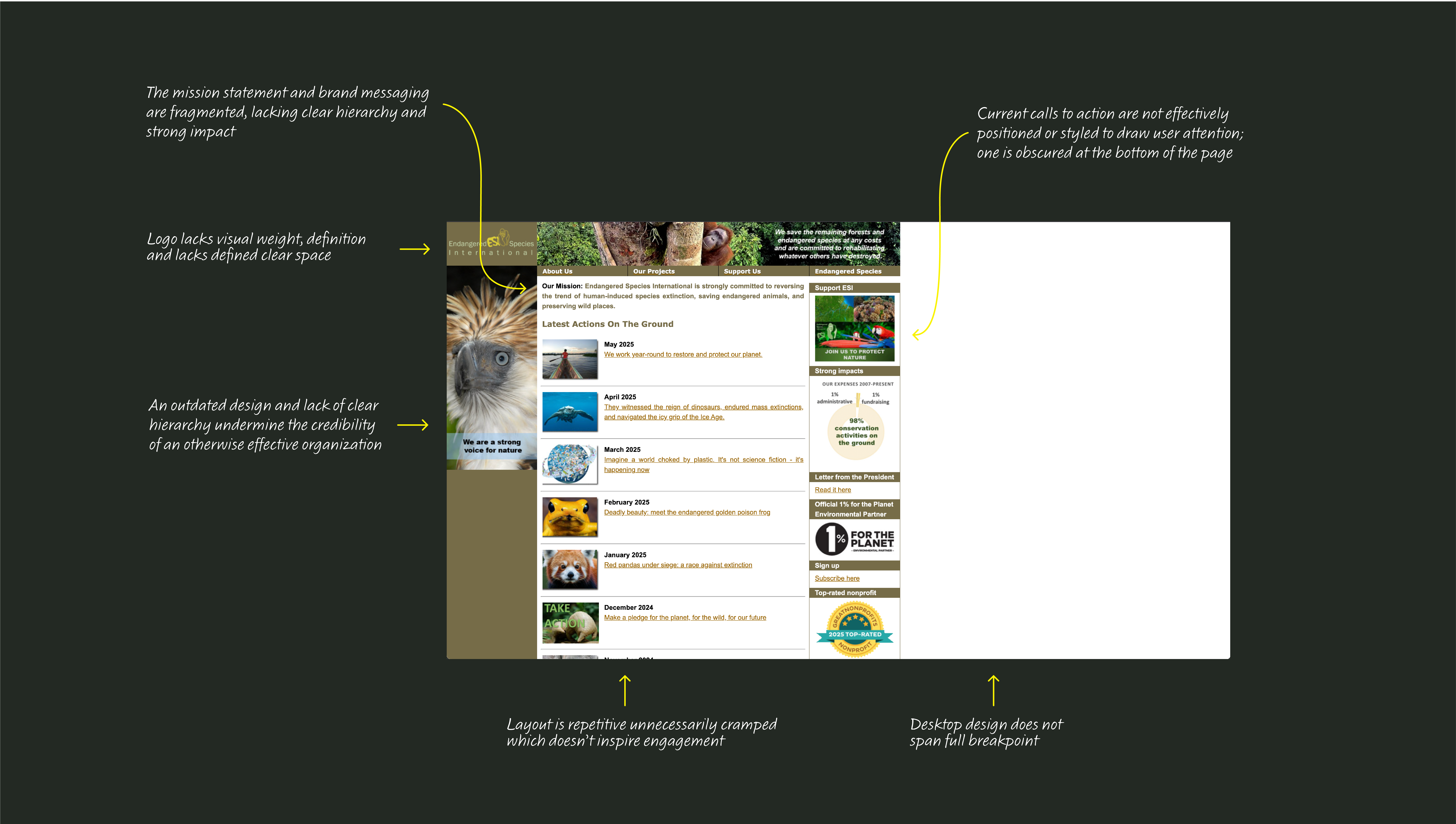
BRAND AUDIT

I reviewed the existing brand system to pinpoint areas that could be refined, clarified, or thoughtfully expanded to better support ESI’s mission and presence.

CLARIFYING THE MISSION

The original ESI logo featured an underdeveloped gorilla mark and typography that lacked structure and cohesion. I redesigned the system by redrawing the gorilla to create a more distinctive, memorable silhouette and refining the wordmark for balance and clarity. The result is a logo that feels intentional, recognizable, and aligned with ESI’s mission.

MISSION CRITICAL DESIGN

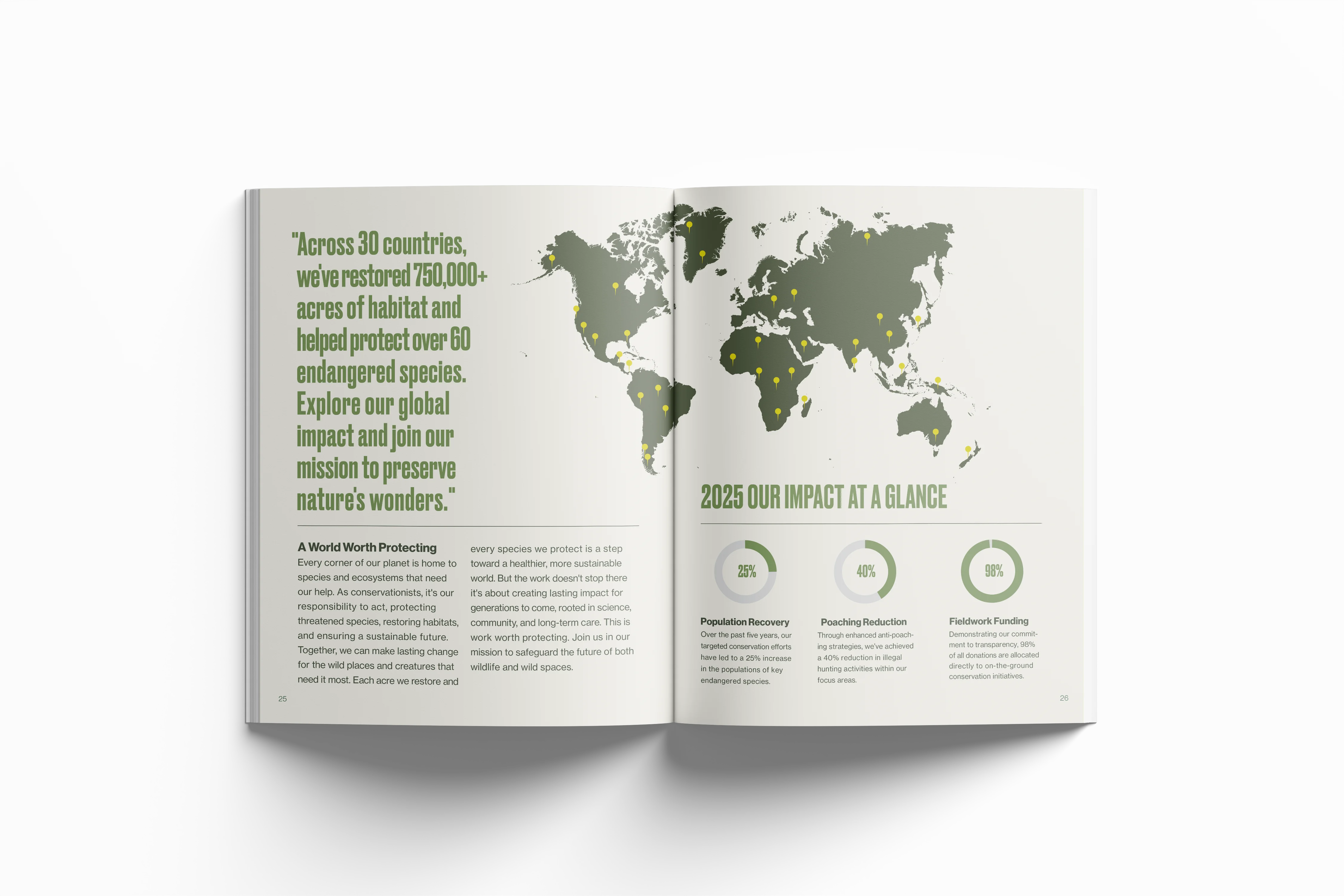
Careful consideration went into updating ESI’s color system to balance aesthetics, accessibility, and utility including high visibility pens designed for fieldwork in remote environments. Both the print collateral and website emphasize the urgency and scale of ESI’s mission. Intimate photography highlights the individuality of the animals and the dedication of those protecting them, while data driven layouts give weight to ESI’s measurable impact as a science led nonprofit.

More Projects

Say Hi!